

Name and logo
How to write the Home Assistant name, how to use the logo, and how both relate to the Open Home Foundation.
The name and the logo are the most visible parts of the brand. This page covers how to write the name, how the logo works, and what you need permission for.
- Write "Home Assistant" in full, with a capital H and a capital A, and a space in between. Never "HA", "HASS", or "Home-Assistant". This applies everywhere: documentation, the interface, blog posts, and this site.
- Don't use old names. "Hass.io" is now just Home Assistant, and "HassOS" is the Home Assistant Operating System. The automated checks of home-assistant.io flag both.
- Don't translate it. The name stays "Home Assistant" in every language. See the translation rules.
The full software suite is called Home Assistant. Its main piece of software, the Python application, is called Home Assistant Core. That naming dates from January 2020, when the branding was adjusted so the parts of the project are easier to tell apart.
Names change sometimes. Home Assistant Cloud was renamed to Home Assistant Link in October 2026. In the code, it is still the cloud integration.
Home Assistant is owned by the Open Home Foundation, a non-profit. The footer of home-assistant.io says it like this: "Home Assistant is a project from the Open Home Foundation."
The commercial partners of the foundation, like Nabu Casa and Apollo Automation, are allowed to create products that license brands of the Open Home Foundation. The structure page of the foundation explains how that works.
The logo is a trademark and the property of the Open Home Foundation. It is not available for commercial use without written permission from the foundation. Commercial use means anything designed to market or promote a product, software, or service that is for sale. To ask, email [email protected].
The terms of service of home-assistant.io list the Home Assistant name and logo as trademarks, and state that using the website gives you no right to use them.
Run a fan account, a group, or a channel about Home Assistant? Make clear in its name or description that it is not official, so nobody mistakes it for an official account. See Help on social media.
Device makers certified by the Works with Home Assistant program have their own badge and brand guidelines. They apply to certified partners only. For example, partners can say a device is "Certified by the Works with Home Assistant program", but not that it is "Recommended by Home Assistant" or a "Home Assistant product".
The logo is the blue house with the antenna. Each part has a meaning:
- Blue feels stable and essential. A bright sky blue is joyful, clear, and free of clouds.
- The house is the home, simplified to its most iconic shape: an orthogonal house with a pitched roof, without a gable or a chimney.
- The antenna is the most recognizable part of the previous logo. Some see a tree, a set of nodes, or a circuit board. It stands for technology that is smart, connected, and growing evergreen.
Download every version of the logo from the assets repository.
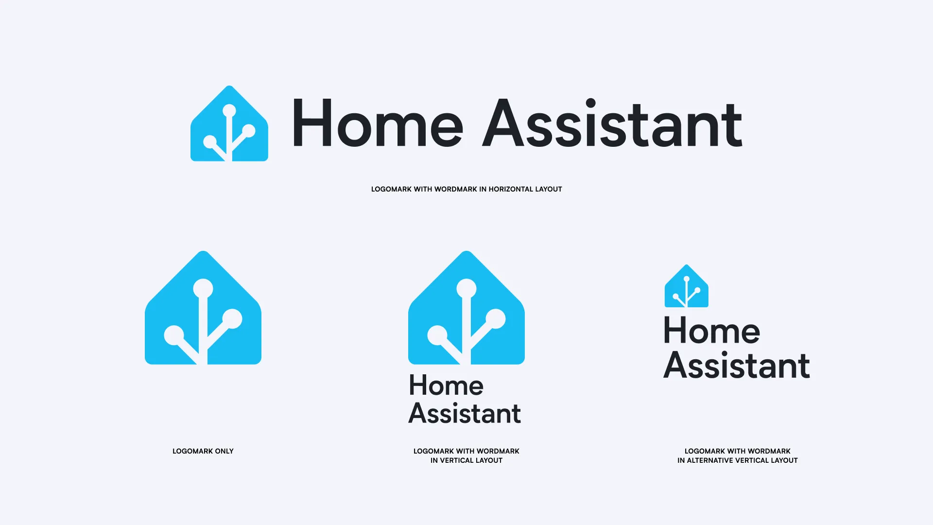
The logo comes in four layouts:
- Wordmark, horizontal: the default. It gives the clearest context, so use it whenever Home Assistant needs introducing.
- Logomark: the house alone, for places where it is clear the logo is about Home Assistant, like inside the app. The logomark can be used without the wordmark, but the wordmark never without the logomark.
- Wordmark, vertical: for spaces with an aspect ratio below 4:3, like a square spot on a shirt.
- Wordmark, vertical with a small logomark: when Home Assistant appears next to related projects, like in a diagram of the voice pipeline.
- Light backgrounds: use the colored version with dark text. This is the default.
- Dark backgrounds, like a page in a dark theme: use the colored version with light text.
- Dark or photographic backgrounds: the light monochrome version works too.
- Light or photographic backgrounds: use the colored version, not a monochrome one.
- No color available, like in print: use the monochrome versions.
Use the logo with black, white, and non-duotone photography only.
- Don't put the logomark in a square, a colored shape, or any other container. The only exception is when another company's marketplace requires it, like an iOS app icon.
- Don't add a drop shadow. If the logo is hard to read on a background, change the background for more contrast. Only as a last resort, use a heavily blurred drop shadow.
- Don't use an outlined version. There is none for this logo. Use a monochrome version instead.
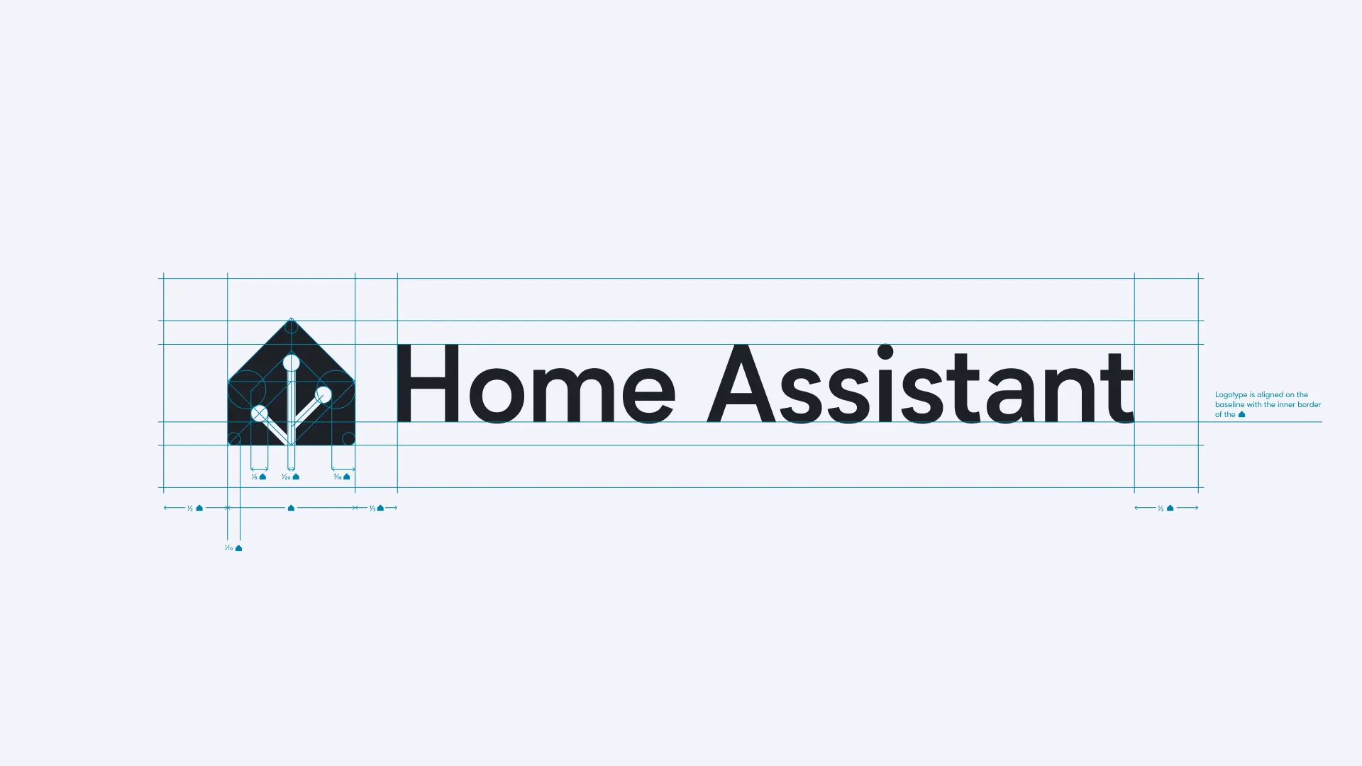
Give the logo room. Keep a clear space around it of at least a quarter of the height of the logomark.
The static logo is the default. Use the animated version only as an introduction, like at the start of a video or on a loading screen.
Use the version with sound only where people expect sound, like at the start of a video. Never use it in an interface, like a loading screen. Don't repeat the animation.
There are special tiny versions for very small spaces, around 16 by 16 dp: the favicon of a website, a notification on Android, or the menu bar of macOS.
This page holds the logo guidelines of Home Assistant. It replaces the logo page on design.home-assistant.io. To suggest a change, start a discussion in the UX design discussions, or open a pull request to this site.